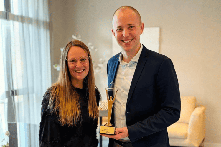
Period: February 2022 – End of 2022
Industry: Tourism, Software Development
Objective: To enhance paxconnect’s existing corporate design, make it suitable for use across all relevant media, and ensure it is consistent, recognizable, and versatile through the use of flexible key and graphic elements.
Services:
- Corporate Design Refresh
- Brand Styleguide (including an expanded corporate color system, typography, and design elements)
- Concept Development
- Project Management
- Campaign Development
The Challenge: Until now, the logo had served only as a brand identifier; key design elements were missing, and the color palette lacked flexibility. paxconnect needed a system that would ensure brand recognition, consistency, and adaptability across all media.
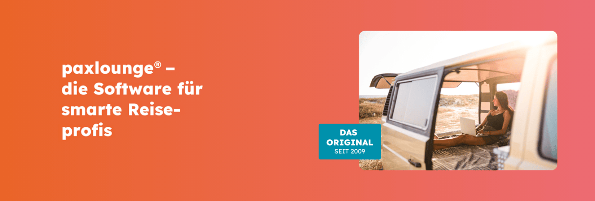
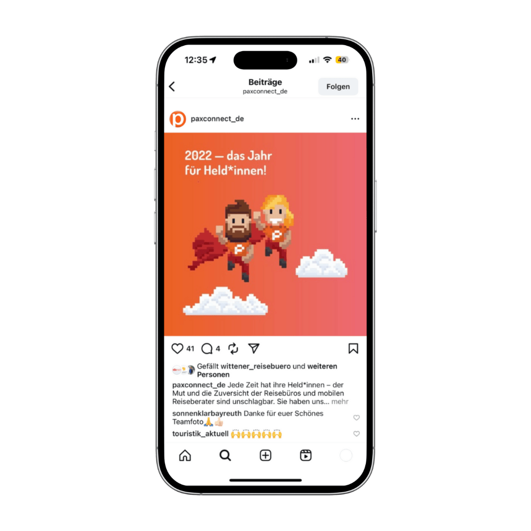
Approach: We began by analyzing the existing corporate design and the client’s requirements. Building on this, we developed a new design system that incorporated the logo’s framework and transformed the “Pax” and “Connect” elements into flexible containers that can be used for content and messaging. At the same time, the color palette was expanded and harmonized: Orange remained the central color, while cyan and green were toned down and supplemented with violet and yellow. Additionally, we developed the “heroes” as new key visuals to add emotional impact to the design. The results were presented in a presentation, feedback was incorporated during a revision round, and the final system was implemented—flexible, consistent, and usable across all media, including sales folders, advertisements, social media, news banners, and trade show booths.
Result: The outcome is a modern corporate design that gains a strong brand identity through the key visuals. The design serves as the foundation for further initiatives and is adapted as needed for specific media, ensuring that the brand remains consistent and flexible in its presentation.

.jpg)
.jpg)